
Kramer’s Ergot 7
The announcement of the details of the seventh volume of the anthology Kramer’s Ergot (KE7) came with quite the internet brou-ha-ha. While Kramer’s Ergot, as a series of anthologies, has earned a reputation for quality art comics, people were upset by the $125 price tag. A $125 new comic ! The reaction is understandable, until you really see this book. It’s huge, the biggest book (comics or not) I have : at 16 by 21 inches just exceeding the size of the lovely Sunday Press collection of Gasoline Alley Sunday pages. The comparable sizes are not coincidental, the size of KE7 is meant to evoke the newspaper Sunday pages of old (think, full-size Little Nemo pages).
The book is printed in lovely full color, too. And the contributors lists features an all-star set of alternative and art comics artists from stars such as Chris Ware and Daniel Clowes to those more obscure to English speaking audiences such as the team of Ruppert and Mulot. The table of contents offers an enticing list of creators, though doing so in a completely random order (KE7 seems to suffer a bit from a separation of design and usability). Most of the artists included have probably never worked for this scale, a rare opportunity. For most of their history comics have maintained a certain modesty of size, in particular on the art/alternative side, where minicomics are the artist’s proving ground.
In light of this context, my goal is to discuss KE7 through the lens of scale. With a work this size the overall page takes on a much greater importance, even more so when the individual stories are often only a page or two. These large pages first strike the reader as a totality. The order of perception is more pictorial than textual : the page is seen first as an overall image and second as a left-to-right top-to-bottom sequence of differentiated images.[1]
While this effect is present, to an extent, when reading more conventionally-sized comics, the physical size of the book here make it harder to simply turn the page and start at the top. You can’t read this book on a train or sitting in a chair, at least, I couldn’t. You wish it came with its on stand, like an old dictionary or atlas. I experienced reading the book by laying it out in front of me on a bed or the floor and leaning over the pages to read them. In this type of position, the top of the page is rather far away. Even if the pages were hung on a wall, where issues of position and movement of the body would be obscured, the size of these pages create a reading that is often more pictorial than textual.
With this in mind, a great portion of my discussion focuses on the use of the page as space, on layouts, and on the composition of the page as a whole. I have largely omitted commentary on the narrative content of the anthology, except where relevant to the effects of scale under discussion.[2]
A number of the artists fail to make much of the scale of the comics page. This primarily comes in the form of treating the large page as a way to add more panels to a page with little or no regard for the page as a whole, as if they just taped four normal pages together to form a larger one. These artists’ contributions could just as well have been multi-page stories in a conventionally sized book without any loss of narrative or visual effect. This failure of context affects some of the most praised artists, such as Jaime Hernandez or Clowes. Even an artist like Dan Zettwoch, who normally uses very diagrammatic or schematic layouts which would translate perfectly to this scale, offers up two pages of uncharacteristically conventional comics.[3]
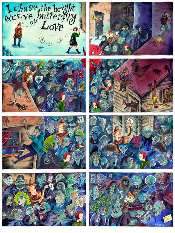
Using the large pages as a space for more panels is made to work by a few artists who take the concept to an extreme level in the service of theme, narrative, or visual power. Gabrielle Bell’s single page tells a dream story in 72 identically sized little panels. The sheer number of panels, each with a narrative caption, form a relentless narrative movement to create an almost overwhelming read for a single page. The large amount of compressed information makes the story that much more like a dream narrative than if the story had played out over a number of more leisurely pages.
Josh Simmons’ horror story offers a similar level of excess, spread across three pages he uses more than 100 panels per page. In contrast to Bell’s more elliptical narrative, Simmons uses no narration, focusing instead of scenes and brief jumps in time from panel to panel. While the story itself is successful, I’m not sure it is improved by the scale, it could just as well have been smaller pages with fewer panels without sacrificing any larger compositional elements or narrative drive. In fact, by using more pages, Simmons could have made use of the page turn for narrative suspense.
The three pages of John Hankiewicz’s comic are, at a macro level, extremely repetitious. His panels are laid out in a regular grid pattern and the content of them maintains a consistent point of view on a room. Yet, he contrasts this almost overwhelming sameness with an ongoing variation of movement in the two characters shown. The first glance sameness offers a barrier to engaging the work on a reading level, though the reader is rewarded upon engaging the pages in that way.
Similarly to using more panels, a number of artists just made fewer, bigger panels per page. Again, there are good and poor examples in the book, depending largely on what else was done with the panels. Many, such as Adrian Tomine’s pages, seem to just be a scaled up normal comics page. While others use the large panels to greater effect.
Ron Rege’s pages use only nine large panels each, but the layout works visually and thematically with the narrative. Visually, he’s printed a reversed layer of the line art in a separate color on each page. This creates a strange visual vibration that subtly creates an almost staticky effect that fits well with the radios seen in the story. This also works thematically with the characters’ immersion in sound, creating a similar sense of visual immersion in the comic itself.
A sharp contrast in panel size is used by Tom Gauld in his multi-page version of the Biblical Noah’s Ark. The first page (a recto) is a series of fairly conventionally sized panels, but when the reader turns the page he is faced with a huge panel, taking up most of the second page, which shows the ark under construction. Gauld repeatedly uses huge panels to stress the scale of the ark in comparison with the figures that occupy the smaller panels.
Ruppert and Mulot use a similar sense of scale in their two-page story, which cleverly makes scale and seemingly endless space a thematic element of the comic. The first of their two pages holds only a single panel showing the stairway that is the setting of their comic — a stairway that goes off-panel with an illusion of endlessness. The second page uses large panels to stress the space and smaller panels to show interaction between characters.
A few of the artists’ use more or larger panels to pay homage to the large color Sunday newspaper pages which inspired the anthology’s scale.
Sammy Harkham, editor/publisher of Kramer’s Ergot, tops his page with a title banner and then fills the page with a regular gridded layout. The narrative itself starts in media res and pretends to be a page from somewhere in the middle of a longer series. In its loose style and simple colors it is very much a pastiche of those now extinct Sunday pages. Jonathan Bennett offers a similarly layed-out page with a title banner, though his narrative is more clearly self-contained.
Richard Sala’s contribution pays attention to the page as a whole. His page is perhaps an homage to those Gasoline Alley Sunday pages by Frank King which featured characters moving from panel to panel across a single continuous background.[4] One of Walt Holcombe’s pages uses a architectural layout, with panels acting as columns on either side of the page holding up the title banner, that is reminiscent of Lyonel Feininger’s comics work. Both of these effects give the page an overall unity that benefits both a pictorial and a textual view of the content.
This attention to the composition of the page on a macro level is addressed by a number of the artists.
Ivan Brunetti offers one of the most interesting compositions in his autobiographical page. He divides his page into two sections, with a title strip in the middle of the page. The upper half of the page is right-side up, while the bottom half is upside down. This forces the reader (unless s/he can read upside down) to physically turn the book around, no mean feat with a book this size. This process forcibly emphasizes the scale of the page, though I am not clear on the thematic necessity for it.
The two page spread of Frank Santoro uses a very few large panels, but, in contrast with many of the artists using larger and fewer panels, he has clearly paid close attention to the overall composition of not only the single page but the spread. The panels are composed so as to complement each other from one side of the spread to the other. The spread as a whole has the look of a single large drawing rather than a collection of small drawings. His work also maintains an elusively simple narrative that leaves room for the reader to breath, much like the images themselves.
John Brodowski’s page has a symmetrical layout and an almost symmetrical composition to it, with a centrally located panel that acts as a kind of narrative and visual punctuation. He fits a lot onto the page in a way that would be difficult or quite small on a normal comics page. One gets the impression he paid close attention to the location of the images on the page and the rhythm of the panels across the pages.
John Pham’s single page tells the story of two dogs wandering in a dark city. The background of the page is a large image of a street, with a streetlight and a foreshortened building rising up in the left and right margins of the page. At one point, midway through the sequence of embedded panels that make up the majority of the story, a highway overpass crosses over from the background image into a panel, opening a strip with the dogs walking along the highway. The page ends with the dogs reaching the building in the background image, instead of a final panel, the dogs are simply drawn into the background image.
Similar to an attention to the greater page composition are those who use the extra space to create page layouts that are more open, less linear than a conventional page of juxtaposed framed panels, and allow for a more organically flowing and overlapping layout where panels dissolve into and over each other.
Leif Goldberg’s brightly colored, surreal page starts off with a couple of self-contained panels but quickly slips into an overall page composition with elements flying across the page, blending into each other, and creating a breakdown in reading linearity. J. Bradley Johnson’s page offers a similar non-linear reading, but it is more clearly structured into two paths that move down either side of a large central image.
Ted May’s page is a wonderful example of an ambitious layout. Over the top of the page hovers a Frankenstein monster who spreads his arms out to clutch heads on either side of the page, between which sits the page’s title. The middle of the page shows a large isometric view of a space station through which the reader follows the winding path of the protagonist. He reaches the bottom corner of the space station and is teleported to Earth. The bottom of the page holds a sequence of panels that take place on Earth. The panels themselves are fit together to form an arc across the bottom of the page which clearly evokes a planet in space beneath the space station. The whole page is crowded, yet the overall layout of the page is structurally and narratively clear. This is the type of layout that would lose detail and coherence if jammed into a smaller page.
A few artists make use of the extra space to fill the margins of their pages with narrative or decorative elements.
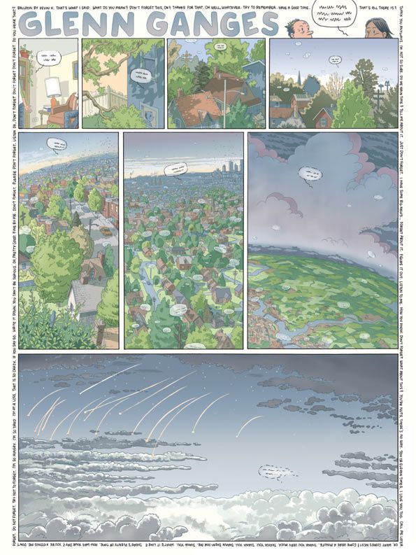
Most successful in this regard is Kevin Huizenga (one of my favorite pages in the book), who surrounds his visually narrative panels with a margin of everyday conversational phrases. The images themselves show a word balloon — its text written so as to obscure actually words — floating away from Huizenga’s character Glenn Ganges. The balloon flies out of the house and into the sky over a town where it joined by other word balloons (in a lovely large aerial panel). The marginalia nicely acts as the background chatter of all these word balloons. The formal play of the word balloons acting like air balloons also adds an extra humorous layer.
Blanquet’s page uses two columns or vertical marginalia on this page, which is also a a fine example of the scale of the page used as an overwhelming device. His many panels in black and white have a visual sameness to them, which when first viewed as a whole page, acts as a screen against reading (though my view on this may be affected by my averseness to his style).
Another method of approaching the page which benefits from the extra space is the mosaic approach, which makes use of numerous small strips juxtaposed together onto a single page/work.[5] A notable example of this approach (outside of this anthology) being Clowes’ Ice Haven.
A number of artists in KE7 (David Heatley, Rick Altergott) use this approach to their works, in some cases as an homage to newspaper comic strip pages. This is seen in Ben Jones and Pshaw’s page which holds four separate comic strips topped with a banner which explicitly references the idea of the ‘funnies’ section of a newspaper.
Less newspaper-like are Seth’s two pages, less successful variation on the mosaic. His pages read as if he started with a number of pages and then just placed them next to each other on the page. His second page, a comics adaptation of an illustrator’s journal, even maintains a distinct notebook paper background to each individual page. Seth’s many small panels across the many ‘pages’ create a very poor reading experience for work that is otherwise very minimally poetic. I’d love to see these pages as the 25-page comic it should be.
Chris Cilla’s two-page spread offers a number of the above-mentioned tactics, including the mosaic approach and open layouts. His story about collectors and hoarding embeds a number of disparate comic strips over a few number of large images. A little impish creature moves (repeated numerous times) across both pages. The images and strips are almost all using different narratives and characters, but they all revolve strongly around the central theme. I had a rather negative visceral response to his page on first viewing, but by actively reading it, it became one of my favorite in the book.
With the scale of the book approaching a more conventional sense of fine art drawing and painting, a few artists approach the page as a single large image. With few exceptions, these large images maintain a comics approach to narrative or text-image juxtaposition. For instance, Matt Groening’s and Southern Salazar’s pages are single images which use the placement of text to move the reader through the page.
One of the highlights of the book is Carol Tyler’s page which is primarily a single image, but within the confines of the space she includes a few embedded panels and a textual caption that references numbered elements on the drawing. It creates an image that is as much diagram as comic, but which maintains both an immediate pictorial viewing and a subsequent reading. In reading through the page, the reader moves not in a straight top to bottom path but in an up and down jumping way between numbered areas in the center of the image to textual notes at bottom.
Jerry Moriarty’s painting comics offer a similar dual viewing experience. Perhaps due to social conditioning in looking at ‘paintings,’ his pages (two non-subsequent single-page images) maintain a stronger sense of their unitary wholeness despite their division into panels, with a secondary sense of reading through the panels. His pages also benefit from scale to better expose brush strokes and painterly effects that would be lost at a reduced size.
With the number of high profile names who failed to really take scale into account, it’s a pleasant surprise to come upon Chris Ware’s two-page spread. He really takes the scale to heart by centering a life-size (or nearly life-size) image of a baby onto the spread. The rest of the page is much less complicated and much more linear than similar pages Ware has done, such as a number of pages in Acme Novelty Library 18 which feature a large figure centered on the page (the same woman who is the protagonist of the story in KE7). Those pages use a more diagrammatic approach to leading the reader nonlinearly around the surrounding panels, while the panels in this anthology are read in a straightforward way. The key to this page is the size of the baby which strongly emphasizes the importance of it to the protagonist (his familiar woman with the false leg from Building Stories) as well as the importance of the two mother-daughter relationships at play in the story.
This is by no means an exhaustive look at the anthology, but it does address the many ways the scale of the pages (and the images therein) allow for a variety of tactics in approaching comics. Many of these approaches are not limited to very large pages, but with room to breath and open up, the comics created at this size can take better advantage of them.
Does this make up for the price ? I’d hazard that KE7 would have been more effective with fewer pages. I’ve heard that there was active editorial work by Harkham in accepting, rejecting, and asking for reworking of pages, though I am not sure to what extent. The book as a whole would have been stronger (and cheaper) if the editorial hand were a bit stronger in rejecting work that didn’t need these large printed pages. Save them for a conventionally-sized anthology.
Notes
- I’m borrowing this idea of ‘order of perception’ from Lawrence Abbott’s “Comic Art : Characteristics and Potentialities of a Narrative Medium.” (Journal of Popular Culture 19.4 (1986) : 155-76).
- For a reaction to KE7 that is more of focused on the narrative/visual content in general, I recommend Matthias Wivel’s post at the Metabunker. I find myself agreeing with the majority of his assessments.
- See his work in Kramer’s Ergot 6.
- See an example.
- Hat tip to Craig Fischer and Charles Hatfield for this concept and label, which coincidentally enough, was first discussed in a post on KE7 editor Sammy Harkham’s Crickets, where Fischer called it ‘little fragments.’ Charles Hatfield applied the label ‘mosaic’ in a follow-up. See also a subsequent response from Fischer.
 Polyominos
 40075km comics
 Corée
Corée
 Japan
Japan


