Dash Shaw
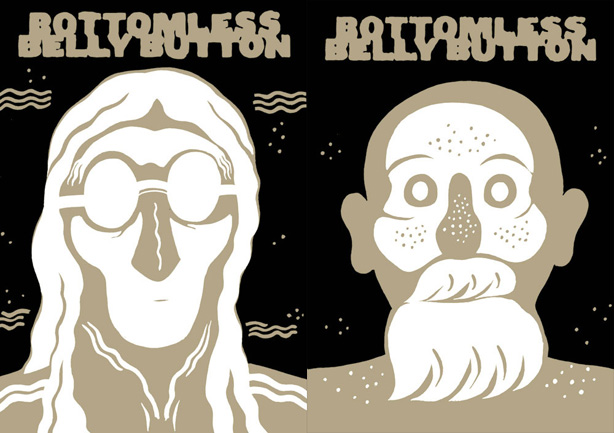
More than a few similarities could be brought up between Dash Shaw and Craig Thompson. Both were unanimously hailed as “young prodigies” by American critics. They both acknowledge international influences (Japanese and European), they both play with the narrative flow and show a lot of sensitivity when evoking human relationships. Yet, comparison stops there. While Craig Thompson has let his line run free, Dash Shaw has shown absolute control along all 720 pages of his Bottomless Belly Button where all sequence is meticulously built. Conversation with a young author who gives a particular attention for detail, without forsaking his storytelling.
Nicolas Verstappen : How did you develop the Bottomless Belly Button script ? Had you in my mind since the start that it would be a 720 pages story ?
Dash Shaw : I didn’t have a script. I had an outline of sequences, and I would just draw scenes and decide whether or not to put it in the finished book, or where to put it. Because of the quality of the drawing, it pushed the experience closer to writing. It’s easy to write a paragraph and then delete it or shuffle it around. For the drawings in BodyWorld I can’t do that, but for Bottomless I could. That was the experiment anyway.
I knew that the pace of it was going to be extremely slow, but read very quickly. More like Japanese comics, but spread out, or like looking at a film strip individually as panels. That kind of storytelling takes up a lot more pages.
NV : I’ve noticed that you’re also using many graphic signs and words to translate odors, sounds, tastes or textures (steam, dust in air, ocean sounds, loud music…). Is it to compensate the lack of those “effects” in comic art ?
DS : It’s a cataloging of natural phenomena, which repeats throughout Bottomless. It’s used for a lot of different things, to create relationships between things, or to act as a specific sound effect, like how Japanese comics have more specific onomatopoeias. It’s about creating an environment mostly. I don’t think I’m compensating. I like it that comics don’t have sounds and smells. Sometimes a word is nice, seeing the words “garage door opening” is different than hearing a garage door opening or seeing it happen. In my webcomic BodyWorld I emphasize rain hitting different things, with words saying “rain hitting pavement” or “rain hitting embers” and that creates a sound and ties together the three rain scenes throughout the book. Words are different than pictures. They can be brought in to do a lot of different things.
NV : As you’re mentioning Japanese comics, you’re also using the japenese aspect-to-aspect transition that is “used to establish a mood or a sense of place” (as defined by Scott McCloud) or even the non-sequitur transition. Did you read a lot of japanese comics ? Do you feel a strong influence on you ?
DS : Yes. I grew up during the manga/anime explosion here in the states. I remember going into a video rental store and they’d just have Akira and Dominion Tank Police, and then I’d go back next week and they’d have The Guyver, and then next week another… It grew and grew. Suddenly there were a million people at Otakon and little anime conventions were popping up all over the place. Bottomless Belly Button, in particular, is basically early post-Tezuka manga crossed with American alternative comics like Chester Brown and Chris Ware. It’s over 700 pages but takes less than four hours to read, and not very much happens in the story, so it’s somewhere between a long book and a short book. That kind of reading experience obviously comes from Japanese comics.
NV : Sammy Harkham wrote me about Poor Sailor that he wanted it to feel like a story told in past tense, like it already happened. I had the same feeling while I was reading Bottomless Belly Button and I think it was linked to the choice of the brownish color ink. Was it the feeling you wanted to give ?
DS : I don’t think it’s in the past tense, but I often communicate things assuming people already know what’s going to happen, as if you’re reading it for a second time. My comics are usually drawn from a perspective of seeing the whole book at once. Maybe the brown makes it look sepia-y or faded, but I think of it as being sand-like. I just liked the way the brown ink looks with the covers.
NV : You’re using the color gouache paint on acetate (like an animation cell) for many of your stories. Where did you learn that technique and why did you use black and white (or sand and white) for Bottomless Belly Button and The Mother’s Mouth ?
DS : Parts of The Mother’s Mouth was done in color, on acetate, but it was printed in greys. I’ve done other short stories in color too, and sections of a longer story. Most of the older comics were done on acetate, like Batman : Year One brilliantly colored by Richmond Lewis. Some of the THB inside covers by Paul Pope were done that way. Lots of people used to color that way. I just combined the acetate layers with computer coloring. I don’t think Bottomless would have been good in color. Different books are different environments and so they have different looks. What I do after BodyWorld will be half one ink and half color, colored differently than BodyWorld.
NV : In your stories, you’re using a lot of diagrams like Kevin Huizenga in his Glenn Ganges. Does that use of diagrams seemed natural for you at the beginning ?
DS : I like maps and diagrams and word-image combinations, like comics. Huizenga and I have both used diagrams but we’re very different cartoonists.
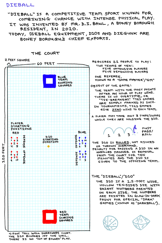
NV : In BodyWorld, there’s a game called the dieball. The D10 is mostly linked to RolePlaying Games (I played a lot as a teenager). Did you play RPG and can we see there an influence in constructing worlds (drawing map for BodyWorld), characters ?
DS : I played Dungeons and Dragons hard-core. I was the Dungeon Master, playing about every-other day after school and a long game on Sunday for about 5 or 6 years. I quit playing early Junior Year (of High School) and basically transferred all of my energy into comics. I learned everything, creating an environment, characters, stories, from playing D&D. My games were very character-driven and social. I know that a lot of cartoonists have played D&D, and there must be some kind of relationship there, but many of the others focus on monsters or weird creatures. I guess I never got into that part of it. I don’t remember drawing monsters a lot. I mostly made maps and characters and stories.
It’s strange to me that D&D has a misanthropic reputation, because it is a very social game. It’s people sitting around talking. That’s all it is. I think it’s an important game that children should be taught and encouraged to play.
I came up with Dieball when I was in Middle School because I thought a sport should use a large die. I worked it into BodyWorld because I thought it fit well. These other-world stories always have a strange, new sport, right ? Like how Harry Potter has Quidditch. But Dieball could actually be played in real life. I hope that it is some day !
NV : In his very interesting essay about comics and RPG, Dylan Horrocks writes :
“A common thread running through much of that work, in my view, is an emphasis on geographical narrative on the construction of a virtual environment in which the audience can explore and even ‘play’.”
The geographical narrative seems also important in your work. Is you work a map where the reader finds his path through different possible roads ?
DS : When I’m at the drawing table, I want to be transported to another place. I want drawing comics to be as enjoyable as possible for me, so everything is constructed around that. I want to be in a different environment, following characters who are enjoyable to draw or make me laugh. If this wasn’t the case, I would be less prolific and more tortured. But, as it is, I draw most of the time every day and I feel very happy and fulfilled. I feel like I’m taking different vacations and exploring different areas.
NV : I share the feeling with Xavier Guilbert (who wrote a very interesting review of Bottomless Belly Button) that the structure of the book is set as classical tragedy play (with three acts, the family house as the main stage, the week as unity of time and the divorce as unity of action). Do you think this structure is underlying to the scenes you’ve edited together ?
DS : That sounds nice. I wasn’t thinking of classical tragedy in particular, but I was thinking about structure. I always have a very clear structure in my mind. Like I said before, the comics are done from a perspective of seeing the whole thing at once, so there’s an overhead structure or design to it. Ideally, if you’re inside of it, reading it, it feels intuitive and improvised, but when you step back it’s solid.
I wanted to limit the location to put the focus on the characters and their actions. I hadn’t thought of that before, but I guess it is like how a stage is set and you just look at the actors performing.
And, as for it being a tragedy, I guess that it is very bleak, but I hope that there’s a lot of tonal variation. Something that I strive for, and think that most comics lack, is a wide range of tones or conflicting feelings/atmospheres. Most comics hit the same note over and over until the comic is done. But I hope Bottomless is a little roller-coaster ride of different feelings.
NV : Using a frog head for Peter (and Mickey Mouse-like gloves) in BBB is very interesting. Do you remember how you took the decision to draw him with an animal face ? Had you already that wonderful sequence with Kat in mind (the one with the only panel with Peter’s human face) ?
DS : I wanted all of the characters to have drawn themselves. That’s sort of the thesis statement for the book : that this was a web of intersecting autobiographical comics. Each character was drawing their own autobio comic and they all connected to form a larger tapestry. Peter, who would view himself as something completely removed from his family, would draw himself as a foreign outsider-like thing. I thought the frog would work, like he had a romanticized view of himself as an outsider, a frog prince. The joke with that character is that he has low self-esteem, but understandably so. He thinks his dad doesn’t like him, and his dad really doesn’t like him. It’s like if someone asks you “does this shirt make me look fat ?” and you say “yes.” The other characters drew themselves too, but they drew themselves more humanoid.
About the panel with his human face : it just felt right. It could have been worse : it could have “revealed” at the end or something. But one panel, buried in the middle of the book, felt right. Some people have read the book and not noticed it.
The way the book was drawn, I’d draw scenes and edit the book together. So that scene wasn’t particularly planned to be in the book, I just liked how it turned out and decided to put it in.
NV : Bottomless Belly Button is “a web of intersecting autobiographical comics”. Is that idea a development of your Two Places short story back from 2006 ?
DS : I started working on Bottomless in 2005. And then I did a comic explicitly about that idea, Two Places, which ran in The Drama magazine, which also happens be a square-sized magazine.
NV : Many of your earlier works are “square-sized” stories. Why did you choose that format to draw ? Does it give you a specific pace ?
DS : An anthology called Meathaus 7 : Love Songs and the School of Visual Arts magazine Visual Opinion were both square-sized, and I was contributing to both of those, so I started doing a bunch of square-format stories.
NV : BodyWorld is a webcomic. Did you thought it would be published as a book (by Pantheon, I think) and that its aspect might change being printed ?
DS : Originally, I thought it would either be a monthly series from Dark Horse or a webcomic. Dark Horse does Star Wars, you know ? So I thought it would be awesome if they did this monthly, and I knew I could deliver it as a monthly. But they weren’t interested in BodyWorld. They never wrote me back (until recently.) And I was still waiting to hear back from Fantagraphics about Bottomless. The way I work is that I just do things and try not to think about publishing, so I just thought I’d do it as a webcomic. That way, I’m in charge of everything. I don’t have to rely on other people for anything. Also, I love webcomics and I’d been thinking about webcomics anyway. So I planned it out and finished a couple of chapters in advance and started serializing it the first of January, 2008.
The Pantheon version will attempt to recreate the format of reading it on the computer. It’s vertical format (with a top and bottom page, instead of a left and right page) and the maps open on French folds, like different tabs on a web browser.
The way I see it is this : If you’re going to follow it weekly, the web version is better. If you want to play the game and get the serialized experience.
If you’re going to read it all at once, the print version is better. Because it’s over three hundred pages, you know ? That’s not pleasant reading on the computer. So after it’s serialized the print version is the end product.
After I finish BodyWorld, I need to focus on other things for a while, but I’d like to go back to a webcomic again, aiming for something that could never be printed. I’m happy that BodyWorld will be printed, but it’s frustrating that the end product isn’t a webcomic, in a way, because that’s what I was interested in. So the post-BodyWorld webcomic I do would use the format in a way that couldn’t be printed, possibly with things like animations, or using a copyright character. Since webcomics are free and open, I COULD do a graphic novelization of a movie or use a copyrighted character and it’d be fine. That’s an exciting possibility I want to take advantage of in the future.
[Interview conducted in November 2008 through emails for the XeroXed #15.]